

Friday, December 24, 2010
Tuesday, December 21, 2010
Illustrators I Greatly Admire: Exhibit E
AnnaLaura Cantone
I first came across AnnaLaura Cantone's illustrations a while back as I flipped through a Houghton Mifflin Kids catalog and found Prudence and Moxie by Deborah Noyes. The combination of the illustrator's looseness and her confidence in her mark making made me rip the page out to explore her work a little further.
Of course the page went in the pile, as pages tend to do. I finally found that catalog page as I was cleaning our office space last week, and I took a minute to see if I could find more of her illustrations.
Her Web site looks as though it's under construction, but the animations that run on the front page are awfully cute. After some more searching I found a LiveJournal page with a ton of her illustrations, but no real explanation of what I was looking at (not in English, anyway) except for the few self-explanatory book jacket images.
I've bookmarked the blog page and will be returning periodically when I need to remember where I want my illustrations to be. Loose. Confident. Quirky without apologies. Definitely worth another look.
Sunday, December 19, 2010
Dear Fall: If I had appreciated you more, would you have stayed?

I'm already tired of the snow. And the winter. And the scraping of the car every time I want to go somewhere. And the gloves that you can't use to do anything except keep warm. And it really isn't even winter yet for another two days.
I'm not sure I can survive three more months of this! Steaming cups of hot chocolate, now that's what I'm talking about.
We've had one day this month above freezing, so until that day the snow just kept hanging around with no way to melt away.

Maybe I didn't appreciate the other seasons enough. Maybe I complained about the humidity one time too many. Maybe I sat at my computer too much instead of going outside.
Why can't spring and fall last as long as summer and winter?
On the bright side: After Tuesday, the days start getting longer, and then winter will have to hit the road.
Tuesday.
6:38 PM.
Wednesday, December 08, 2010
"Steampunk Heidi" is finished!
I think I'm finally finished with this one; I really don't know what else I can do with her.

I'm about to send her off to Tomie dePaola, and we'll find out on January 3 what he thinks.

I'm about to send her off to Tomie dePaola, and we'll find out on January 3 what he thinks.
Monday, November 29, 2010
"Steampunk Heidi" color #1

The background texture is a combination of a watercolor texture I painted a while back and a photo of my concrete driveway. I tinted the watercolor a reddish tan to help with the steampunk look, and the driveway layer I left as gray.
Wednesday, November 24, 2010
"Steampunk Heidi" sketch for Tomie
Starting this year, SCBWI is taking over sponsorship of the Tomie dePaola Award, although Tomie will still be choosing the winner. I'm not expecting much of a look from Mr. dePaola, but it does give me a subject for my next postcard.
They're looking for an illustration based on the opening paragraphs of the classic Heidi by Johanna Spyri. Tomie claims he wants to see "an image, a style, a vision that I've never seen before!" (exclamation mark included) I'm having my doubts that that's entirely true, but I'm going to enter anyway.
This is the sketch I came up with:

I wanted to add a little bit of my own twist to the illustration by giving her a steampunk attitude. The timeframe would be right-ish, and the goggles were especially helpful for a reflection of the Alps.
 Addendum: As an aside, here are the scrap paper thumbnail ideas I was playing with. I guess technically I went with #2.
They're looking for an illustration based on the opening paragraphs of the classic Heidi by Johanna Spyri. Tomie claims he wants to see "an image, a style, a vision that I've never seen before!" (exclamation mark included) I'm having my doubts that that's entirely true, but I'm going to enter anyway.
This is the sketch I came up with:

I wanted to add a little bit of my own twist to the illustration by giving her a steampunk attitude. The timeframe would be right-ish, and the goggles were especially helpful for a reflection of the Alps.

Wednesday, November 17, 2010
If I've ever said anything bad about Steve Jobs, I want to take it back now
Right.
So my MacBook belched up a huge hair ball, and decided now would be a good time to never, ever allow itself to go through that whole "Start Up" bull again. After some pleading on my part, it decided to let me sneak in through the Safe start mode, so I backed up anything I could get and could possibly ever use on a computer again.
That's when it realized I was eating it's brains.
It complained my OS reinstall DVD had fingerprints. (It didn't.) Then it ate said OS reinstall DVD and laughed, "Neener, neener." Then it totally deleted the idea that it had ever even contained a hard drive to boot from.
All this in less than 24 hours.
So.
I called our local Apple Store last evening, and the nice young man (Benji) scheduled me for an appointment this morning. And, well, my laptop isn't all that new. O.K. Fine, it's like four years old now. So, so totally out of warranty.
Me: Crap. I'm so not going to be able to afford this...
Walked into the Apple store this morning and, after drooling over the iPads, I finally got a sit-down with my own personal Genius Bartender, Mike.
Mike: I don't know if we still have Tiger on our Network. Would you like to upgrade to Leopard?
(Me: Crap. I'm so not going to be able to afford this...)
Mike: (Plugs in magical "Network." Plugs in computer. Ejects DVD--huh?) This should take about five minutes.
(15 minutes later...)
Mike: O.K. You're good to go.
Seriously? I sat as still as I possibly could for a few seconds so as not to draw attention to myself and the fact that I hadn't paid them. For anything.
I closed the lid and looked around to see if anyone was watching me leaving with a new operating system on a newly serviced laptop.
Apple employee as I snuck out the door: Have a nice day!
But the no-longer-under-warranty bill. The Tiger-to-Leopard upgrade. Do they know where I live? Are they going to accost me at a later date? When I'm sleeping?
I'm thinking I don't think so. I'm thinking this is what I paid for when I bought the thing in the first place. I'm thinking Steve Jobs must have figured out how to take a flying leap over his old buddy Bill.
Thank you, Mr. Jobs. That's not sarcasm. I really mean it this time. I will recommend your stuff. Apple products for everyone!
P.S. And thanks for giving me iWork (which I paid for the last time) for free in Leopard.
P.P.S. And thanks extra for employing Mike who resuscitated my little digital corner of the world.
Now to reinstall absolutely everything.
Sunday, November 07, 2010
#WPaSCBWI 2010 Fall Conference
One week from today—save the date.
The Western Pennsylvania chapter of the Society of Children's Book Writers and Illustrators will be hosting their annual conference at the Greentree Radisson in Pittsburgh next weekend, and I'll be speaking about social networking.
First, the info:
Faculty include:
I'll be leading two workshops titled Social Networking—I Don't Wanna! The first one (session B-2) from 11:30-12:15 will be geared toward a general audience, mostly writers. The second one (session C-4) is scheduled for 3:15-4:00 and will be geared toward illustrators, but I will also accommodate anyone who may have missed the first session.
I have the presentation set up to answer attendee-specific questions including:
Once I get the presentation finished, I will upload it here:
http://www.nora-thompson.com/wpascbwi.html
The Western Pennsylvania chapter of the Society of Children's Book Writers and Illustrators will be hosting their annual conference at the Greentree Radisson in Pittsburgh next weekend, and I'll be speaking about social networking.
First, the info:
Friday, November 12
Pre-Conference Event
(You must also attend the conference)
7pm–10pm
Reception and cash bar followed by informal round-table critiquing.
Bring a 5-page manuscript to read aloud.
Saturday, November 13
Conference
8am–5:30pm
Faculty include:
- Emma Dryden Dryden Books
- Rachel Abrams HarperCollin's Children's Books
- Deborah Vetter Cicada and Cricket magazines
- Quinlan Lee agent, Adams Literary
I'll be leading two workshops titled Social Networking—I Don't Wanna! The first one (session B-2) from 11:30-12:15 will be geared toward a general audience, mostly writers. The second one (session C-4) is scheduled for 3:15-4:00 and will be geared toward illustrators, but I will also accommodate anyone who may have missed the first session.
I have the presentation set up to answer attendee-specific questions including:
- Why do I have to social network?
- Where do I start?
- What do I say?
- When am I supposed to do this?
- How do I get it right?
Once I get the presentation finished, I will upload it here:
http://www.nora-thompson.com/wpascbwi.html
Thursday, October 21, 2010
B&W Becca
Thursday, October 14, 2010
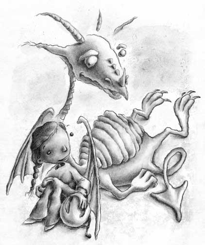
New kid's illustration preview

The biggest change from the sketch was curving the top of the castle wall. I think it gave it a little more of a disorienting kind of edge.
Another small change was with the dragon's tail. His name is Draco, first of all. And he isn't as tough as he tries to make himself out to be. (I've sketched out the image that will be going on the back of the postcard which will explain what I mean. You'll have to check back in a few days to see that one when it's finished.) As for the tail; I changed it. No biggie.
Monday, October 04, 2010
O.K. Fine. I'm back.
After a brief four-month-or-so hiatus, I found the encouragement I needed to keep plugging (thanks to Cliff Knecht and Cricket A.D. Karen Kohn). So I'm back, and I've got some work to do.
 First up, I have a postcard to get painted and mailed, and I've uploaded the sketch for it to the right over there. The girl's name is Becca. When I get the color version finished, I'll post it here.

Tuesday, September 28, 2010
Matthew Carter a 2010 MacArthur Fellow
Here's a guy you have likely been reading for years and didn't even know it. Read about Matthew Carter's becoming a $500,000 MacArthur Fellow here. Carter has been designing typefaces for something like 50 years, and he worked as a punchcutter when first starting out, and later kept right up with technology by designing faces digitally.
You know that tiny type they use in the phone book? Take a look. It would look kind of funky if you used it as a regular face or big for display type because it was designed for a different purpose. The ink on the presses would fill in the counters of the letters (the spaces inside letters like the lowercase "e"), especially on absorbent paper like they use for phone books. Carter created extra pointy spaces in the counters to allow the ink to spread and still be readable.
And you know Microsoft's Verdana and Georgia? Yep. Carter's. Designed to be legible, even at small sizes on computer screens. He also designed Tahoma.
Carter was featured in the full-length film Helvetica where he explained the theory behind his job. He wants you to read and not take any notice the font carrying the message. If you do that, then he believes he's done his job well. So you've probably read his work your entire life, but never even noticed.
Thursday, September 23, 2010
Mega storm damage
And on last day of summer.
Some neighbors lost some huge trees from the storm that rolled through late yesterday afternoon. I happened to catch this lady taking photos of the damage this morning. Sad part is, they had had a beautiful tree-lined driveway and removed most of those trees last year (you can still see one of the stumps still there). They had all been huge like this one.


Some neighbors lost some huge trees from the storm that rolled through late yesterday afternoon. I happened to catch this lady taking photos of the damage this morning. Sad part is, they had had a beautiful tree-lined driveway and removed most of those trees last year (you can still see one of the stumps still there). They had all been huge like this one.

Another tree covered the entire road and took a powerline with it.

Saturday, September 18, 2010
Sasauge Muffing

1. A "sasauge" is not the same as a "sausage" in this part of the country, as far as I know.
2. I guess you need to reverse the number "1" to accommodate all the dyslexic customers? O.K. I understand.
3. (My personal #1 grammatical pet peeve:) Everyday is usually an adjective and means "common" or "usual." Maybe your "Everyday Menu" or your "Everyday Sausage." But if you mean the $1 deal happens "every single day," please, please use two words.
Stepping down from soap box. Please, carry on.
Friday, September 10, 2010

Sunday, September 05, 2010
Uh, yeah that's a snake

So I grew up in the country surrounded by woods, and we had snakes. I never really got used to that. I live a little less in the country now, in a spot that is being surrounded by development. Little by little, the natural habitat of the animals that live around us is being taken away.
We've always allowed our property to grow as wild as possible, first for privacy and second for wildlife. We've encountered opposum, ground hogs, raccoon, deer, squirrels, chipmunks, a weasel, (possibly) a black bear and many, many species of birds. But until this summer we had never seen a snake.
I guess it was only a matter of time.
I didn't see or get a shot of the bigger garter snake we had had on our property earlier this summer, but I'm thinking that one might have been a mom. The one I did see and get shots of was just a little guy, sunning himself on the concrete around our outdoor building. He let me take the close-up above which makes him look bigger than he really was. The photo below gives a better comparison. He was only about as big around as a pencil.
And, as was tradition when I was growing up, his name is Charlie.

Tuesday, August 31, 2010
R.I.P. Glenn Pavone

No exaggeration.
I once saw him tuning his guitar in the middle of a solo. On that same night, I saw him placing an order with a waitress while in the middle of another solo. He was the kind of guy who made it look easy.
The picture I've included here was one I took in 1994, somewhere around the time The Cyclones had released their first album, Twist This.
To get an idea of what he was capable of, take a listen:
Mr. Pavone was 52 and will be sorely missed.
Monday, August 23, 2010
Convoluted painting

Thursday, July 22, 2010

Monday, July 05, 2010
Killer Birds

Turns out house wrens aren't as cute as they look.
I had just come back from a run when I saw a commotion in the nest not typical of what we had seen with previous occupations. I walked over and asked what they were doing (literally, I said, "What are you doing?"), and one of two birds flew out. The second one clung to the side of the birdhouse, and just stared at me (me standing less than a foot away). I could see the end of its beak was wet, and at least one egg partially hanging out of the entryway (exitway?). That second bird flew off, so I was able to get a good look inside.
Mass murder.
Within a few hours, somebody or other had returned and tossed what was left of the eggs out onto the concrete of the porch floor (see bottom inset). Interestingly, this isn't the first time this has happened. We're thinking it's all a territorial dispute, and it may be gang-related.
The sad part is the bird (or birds) that keep returning to look in the nest and cry on top of the house, refusing to go in. The good news is, our second birdhouse--which hasn't been occupied since the fall I cleaned out a baby bird skeleton--is showing signs of activity.
Wednesday, June 16, 2010
Keri Smith
When I want to feel like an incompetent, underworked artist, I visit Keri Smith's Web site.
Tuesday, June 15, 2010
TTFN
If you've read my last entry, you already know about the frustration yada yada.
After some soul searching and decision-making, I've decided to allow the kid's illustration part of my life to take a back burner. I'm finding it difficult to justify pouring money and time into a part of my career that has no intentions of going anywhere anytime soon.
I'm still working on books I've been writing and illustrating aimed toward kids, but creating more self-promotional illustrations feels like a waste of time right now. My next promo postcard and newsletter is scheduled for August, and I'll see how I feel about sending either when the time comes.
I'm not planning on more entries in this blog in the near future (although you never know what might come up), but you can still follow my other blogs:
The Rots
Hairy Eyeballs
Thompson Graphx/Fine art
So as Tigger says TTFN: Ta ta for now.
Monday, June 07, 2010
Not bothering to bother
I admit it: I've been shirking my kid's illustration duties lately.
When frustration and discouragement sets in, it's hard to keep banging your head against the wall. It just feels so good when you stop. I've been leaning lately in a direction where I am getting positive feedback, and where I don't feel like what I'm creating is getting sucked into the oblivion.
I won't post details here. This is, after all, available for anyone to see who has an Internet connection. I will, however, point you in the current direction of my attention:
http://www.facebook.com/slightly.irreverently.twisted
http://www.zazzle.com/the_rots*
http://www.squidoo.com/the_rots
http://www.the-rots.com
Friday, May 28, 2010
Mexican Restaurant likes the signage

This one will be 96"x30" when it's biggie-sized. Yeah. Pretty big file.
Monday, May 17, 2010
Gris Grimly's Frankenstein in progress
I've been keeping track of Gris Grimly's career since I happened to find his book Edgar Allan Poe's Tales of Mystery and Madness in our local Barnes & Noble a few years back. He's a prolific illustrator. I'm not sure how else to describe his work. He's incredibly gifted and has determined ideas of how his books should look.
I'm terribly envious of his abilities. Can you tell?
Last July he started a blog to share progression of his new book, Frankenstein. He's been uploading images both in-progress and complete, and keeping his readers up-to-date with meetings with his editor and art director. In his latest entry, he posted a page that he wasn't satisfied with and also the pages he illustrated to replace it. I saved both images so I could compare the differences side-by-side, and the subtle detail changes are stunning. To me, anyway.
He's changed the color dramatically, which he mentions in the post, but he also made other, more subtle changes to hand positions, compositions and faces that have me taking a step back.
When I look at the original page, I see nothing wrong with it. As an illustrator, I would have been happy with the result, considered it finished, and moved on to the next page.
Maybe that's why he has the book deal. I'm not sure I have that extra "something" to boost my illustrations from self-promotion to an actual contract. I'd like to think working harder might do the trick, but I'm not sure how much harder I can work. Working harder doesn't give you that "something," and if I don't have it by now, I doubt I'll ever have it.
I am looking forward to Frankenstein; I've loved all his books. They're very enjoyable, as long as I look at them without comparing my own work to the talent in front of me.
Friday, May 07, 2010
Bear scat?

We found two similar piles within a few yards of each other in our front yard. The second one was close to a line of empty (except for the leftover dirt) potted plant containers which were lined up along a wall of our small outdoor building. A couple of the containers had been tipped over, and one was broken in half.
I know, I know, this probably isn't what you typically expect to see on a blog, but we weren't sure what neighbor left this for us. We've done some research, and we're thinking black bear. We checked around the property and didn't find any kind of territory markings on the trees, but we've found bark scraped off before. We're thinking he was looking for grubs behind the pots.
The bright circle toward the bottom center is a quarter I put in for size comparison. I think the droppings are pretty impressive, no matter what left them.
And now that I think about it, I haven't seen the neighbor's cat around lately.
Tuesday, May 04, 2010
Newsletter coming this month
As you may have seen at the top of this blog, I'll be changing over to a professional newsletter generator beginning this month. When I first started sending newsletters, I used the generator that CafePress made available to shop owners, but over the past year or so I've gotten a little fed up with their system. Using their interface was more of a hassle than it was worth, and the end results never looked all that great anyway. So I decided to jump ship.
I've signed up with MailChimp to send future newsletters, and so far the experience has been better than expected. I'm able to control the graphics, the fonts and the layout which I wasn't able to do before, and I have to say, it looks a whole lot better. I'm working on the Spring edition right now, and I'll be sending it out sometime over the next few weeks.
If you would like to subscribe or if you were a subscriber with the CafePress version of the newsletter and need to re-subscribe, use this link. Newsletters go out quarterly, so I won't be inundating your inbox. You always have the option to remove your name from the mailing list at the bottom of each newsletter edition, on the "Newsletter" page of my site or through this link.
Friday, April 16, 2010
nornie.com
I think I forgot to mention it here before, but I try to keep my different art lives separate so as not to frighten the children. I've built a Web site that has the links to all of them though, and it's here: www.nornie.com. If you're old enough and you can handle the shock, you can take a look at what I do when I'm not designing or fine arting. It keeps me out of trouble, mostly.

Even though all my sites are different, I try to keep a similar feel through each one. I use different fonts and different colors, but I've created a grungy background that has found its way through all of them. It helps me get rid of that corporate "I like to follow the rules" kind of feel because I'm not a corporation and I don't like to follow the rules. At least not as far as art goes.
Nornie was the nickname my dad gave me before I was old enough to understand what a nickname was. Apparently I didn't like it, and I guess I told him so. But it stuck and now it's mine. Thanks, Dad.
Sunday, April 11, 2010
iFrank in Technicolor

Thursday, April 01, 2010
Hiking the Laurel Highlands


Wednesday, March 31, 2010
More illustrations for Jack & Jill
I did a few more spot illustrations for Jack and Jill's March/April issue, and I'll post a couple of them here. The illustrations were part of their Earth Day article that suggested things kids could do to "go green."
 First, they encouraged kids to open a window when the weather was warm enough. I had to play with the "wind" a little bit before I was satisfied. It needed to be transparent enough to show the window behind, but opaque enough to be able to see it in the places where the background was white.

They also encouraged kids to throw their trash away in cans rather than littering.

The throwing trash picture wasn't the only spot where I had to draw hands for this issue. I hung out at the small cafe in our local grocery store one morning and just sat and drew different angles of my hand to give the art director and editors a choice to pick from.

They ended up picking #2.
Saturday, March 27, 2010
Illustrations for Jack & Jill Magazine
Here are a few more of the illustrations I did for Jack and Jill's March/April issue. These ones were spots that were scattered in and around some "how to go green for Earth Day" suggestions.
 This first one encouraged kids to ride their bikes to school. I played with that iconic "school zone" street sign showing kids walking to school by adding a bike rider to the mix.
This one explained the importance of turning off the lights when you leave a room. I worked on some of these while I was on an Amtrak train to Philadelphia with my laptop and a 4"x6" Wacom tablet. The setup worked out surprisingly well.
 And this last one suggested bringing your lunch to school in a reusable bag. I just pictured one of those ones with the canvas strap and Velcro closure, and I added a retro 60s flower shape so it could be used by either girls or boys.
 This first one encouraged kids to ride their bikes to school. I played with that iconic "school zone" street sign showing kids walking to school by adding a bike rider to the mix.
This one explained the importance of turning off the lights when you leave a room. I worked on some of these while I was on an Amtrak train to Philadelphia with my laptop and a 4"x6" Wacom tablet. The setup worked out surprisingly well.

Tuesday, March 23, 2010
New business card design
 I've finally redesigned some new business cards for the graphic design offshoot of my freelance work (the white cards below). I had redesigned my Web site over a couple years ago, but until now I've been using the old business cards with all the old fonts and graphics and abrasive attitude (the black card to the right). I guess I thought I could use them up or something. The problem was, I wasn't handing them out at all. They just weren't where I was coming from anymore.
That was dumb.

And I'm also finally in the position where I can get the cards printed on recycled paper (and did), which satisfies me a great deal.
Monday, March 22, 2010
Jack and Jill Magazine

All the illustrations were for an article about going green for Earth Day (April 22). I painted one big illustration (the one here), and a bunch of smaller ones (I'll post those over the next few days).
Saturday, March 20, 2010
Crocuses

Less than a day after this picture, our local bunnies ate every one of these down to the stem. It looked like a baby lawnmower went through.
Saturday, March 13, 2010
"Read" poster illustration

The idea was mostly for the teachers and librarians who are using my previous "Read" illustration in their classrooms and libraries. I wanted to gear this one toward those "reluctant reader" types (boys).
I'll be painting the whole thing in Painter, and uploading it for posters and note cards on Zazzle and CafePress when I'm finished.
Sunday, March 07, 2010
Paintings I did 20 years ago
I've posted a few scans of paintings I did around 15 and 20 years ago as a photo album on Facebook. If you've seen the scans of drawings from around that time, you'll know these were all finished before I went back to school for art.
I used to use really tiny brushes at the time, and it took me forever to finish a painting. The first image in the album is 9"x12", and it took me around 58 hours to complete it.
I don't do that anymore.
I used to use really tiny brushes at the time, and it took me forever to finish a painting. The first image in the album is 9"x12", and it took me around 58 hours to complete it.
I don't do that anymore.
Saturday, March 06, 2010
My illustrations on somebody else's blog!
Isn't it the coolest thing when you run across your work on the Internet in a place where you didn't put it?
I was doing some site submissions to Google when I ran across a blog from last September that shared some of my work, and the blog wasn't mine. It belongs to Jennifer Daniels, a Brooklyn-based graphic designer and illustrator. Take a look at some of her work. Looks like a very talented lady!
On the blog, she says she likes the way I show the sketch of an illustration right alongside the final version of the piece on my Web site. You can see what she's talking about on one of my online sketchbook pages. If you drag your cursor back and forth across the arrows, you can see before-after-before-after. Even I think it's still fun to do.
Wednesday, March 03, 2010
Drawings I did 20 years ago
I've scanned in photos I found of some old drawings I did a long, long time ago. These are way before I ever went back to school for art, so everything you see in this album was self-taught.
You can tell I was still tight with my lines and basing everything on realism, but you have to get that part down before you should ever try to move on. I didn't know that at the time; I was just feeling my way, and I think art school came along to loosen me up at just the right time.
You can see more current drawings at www.norathompson.us. Click on the "portfolio" link on the left and then "drawings" right below.
Tuesday, March 02, 2010
Animal tracks in the snow
As you probably know, those of us in the northeast got wolloped three times (so far) this winter with buckets of snow. It's always cool to get up in the morning and see what's been in the yard overnight. Because we try to keep our property as natural as possible, we tend to attract the wildlife that used to call this area home. And the neighborhood's domesticated life seems to find it attractive, too.
This time I took a few shots of some of the tracks our visitors left behind.
 A friendly bird made his way the whole way up to our back door stoop. We've seen a bunch of different species at our bird feeder this winter:
 One of our many bunnies who make their summer nests in the bushes in our front yard.
 We also have a lot of white-tailed deer wandering through all year long. They like the crabapples and any new tree or plant growth we have going. When we find a sapling we'd like to keep, we have to protect it with a wire fence until it's big enough that the deer won't destroy it.
 This is likely our neighbor's cat. He's black and a very funny hunter; he never catches anything. He does the crouching down and wiggling his butt thing and then he pounces. Within a few seconds he emerges from the tall grass and walks away as if he meant to miss.
 This one we're still working on. We do have skunks, but they would still be hibernating right now. We've seen a weasle run through the yard once, so we're expecting this was him (or possibly a friend). The track was about the size of a cat's track, but the five toes makes it very distinctive.
 We're not too sure about this one.
This time I took a few shots of some of the tracks our visitors left behind.

- Northern Cardinals
- Black-capped Chickadees
- Bluejays
- Mourning Doves
- Dark-eyed Juncos
- Tufted Titmouses (Titmice?) and
- House Finches


Saturday, February 27, 2010
New business card design

These images show the front and back of their new cards.
Friday, February 26, 2010
Dexter in color

The glowing green and purple colors took some getting used to since most of what I do uses colors that are closer to earth tones than flourescents. But I knew I had to do it, so I put the painting aside for a couple weeks, hoping it would look better later. When I finally came back to it, the color didn't seem as garish as when I had left it.
I like him enough that I'll probably use him for my next postcard promotional mailing in May.
You can click on the image to see him larger.
Saturday, February 20, 2010
New photography portfolio images

My portfolio site URL: http://www.norathompson.us
Banning No. 3 Mine operated just outside Van Meter, PA and is off the Yough River bike trail, part of the Great Allegheny Passage. You can read in more detail about the Darr Mine history and explosion at http://patheoldminer.rootsweb.ancestry.com/darr.html
Thursday, February 18, 2010
Rough sketch for kid's illustration

His puppy's name is Poindexter.
Friday, February 12, 2010
New banner design for Etsy shop


Here's a new banner I designed recently for The Dreaming Owl's Etsy shop, along with the matching identity icon. The Dreaming Owl sells handmade mittens, scarves, jewelry, bookmarks and purses, and requested a banner to reflect the shop's personality. We went with this hand drawn and stylized owl and banner.
Subscribe to:
Posts (Atom)