Well, I shuffled off my latest postcard, and it's already generated a few hits on the site (at least, the timing is right for all the extra hits). Always exciting to see. I'm calling the illustration "Skydiving School" for (I hope) obvious reasons.
The image is over there, on the left, and here's the page I put together for the people who want to go green and see it electronically: http://www.nora-thompson.com/postcard.html.
Showing posts with label postcard. Show all posts
Monday, September 02, 2013
Thursday, October 21, 2010
B&W Becca
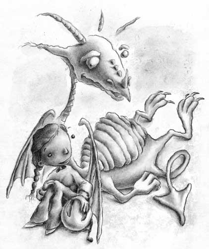
I finished the black and white "Becca" illustration for the back of my latest postcard, and here she is. The color version for the front of the postcard can be seen in the last blog post.
Thursday, October 14, 2010
New kid's illustration preview
As promised, here's the finished version of "Becca," the sketch for which I included in my previous post.
The biggest change from the sketch was curving the top of the castle wall. I think it gave it a little more of a disorienting kind of edge.
Another small change was with the dragon's tail. His name is Draco, first of all. And he isn't as tough as he tries to make himself out to be. (I've sketched out the image that will be going on the back of the postcard which will explain what I mean. You'll have to check back in a few days to see that one when it's finished.) As for the tail; I changed it. No biggie.
The biggest change from the sketch was curving the top of the castle wall. I think it gave it a little more of a disorienting kind of edge.
Another small change was with the dragon's tail. His name is Draco, first of all. And he isn't as tough as he tries to make himself out to be. (I've sketched out the image that will be going on the back of the postcard which will explain what I mean. You'll have to check back in a few days to see that one when it's finished.) As for the tail; I changed it. No biggie.
Tuesday, June 15, 2010
TTFN
If you've read my last entry, you already know about the frustration yada yada.
After some soul searching and decision-making, I've decided to allow the kid's illustration part of my life to take a back burner. I'm finding it difficult to justify pouring money and time into a part of my career that has no intentions of going anywhere anytime soon.
I'm still working on books I've been writing and illustrating aimed toward kids, but creating more self-promotional illustrations feels like a waste of time right now. My next promo postcard and newsletter is scheduled for August, and I'll see how I feel about sending either when the time comes.
I'm not planning on more entries in this blog in the near future (although you never know what might come up), but you can still follow my other blogs:
The Rots
Hairy Eyeballs
Thompson Graphx/Fine art
So as Tigger says TTFN: Ta ta for now.
After some soul searching and decision-making, I've decided to allow the kid's illustration part of my life to take a back burner. I'm finding it difficult to justify pouring money and time into a part of my career that has no intentions of going anywhere anytime soon.
I'm still working on books I've been writing and illustrating aimed toward kids, but creating more self-promotional illustrations feels like a waste of time right now. My next promo postcard and newsletter is scheduled for August, and I'll see how I feel about sending either when the time comes.
I'm not planning on more entries in this blog in the near future (although you never know what might come up), but you can still follow my other blogs:
The Rots
Hairy Eyeballs
Thompson Graphx/Fine art
So as Tigger says TTFN: Ta ta for now.
Friday, February 26, 2010
Dexter in color
The glowing green and purple colors took some getting used to since most of what I do uses colors that are closer to earth tones than flourescents. But I knew I had to do it, so I put the painting aside for a couple weeks, hoping it would look better later. When I finally came back to it, the color didn't seem as garish as when I had left it.
I like him enough that I'll probably use him for my next postcard promotional mailing in May.
You can click on the image to see him larger.
Wednesday, January 13, 2010
The Bald Soprano=Tim Burton @ the MoMA?
The Tim Burton exhibit at the MoMA included a free, take-home brochure that I promptly and eagerly grabbed up last Thursday. The evening prior, I and my fellow museum goers had a bite to eat at a firehouse-turned-brewery in Philadelphia. In the entrance space, you could peruse various postcards and announcements for upcoming local events, and one in particular caught my eye. It was a large postcard for "The Bald Soprano," all in line art with a spiral on the front and hand-written text on both sides. I mentioned that it reminded me of Tim Burton, and so I took a copy for myself.
When I returned home with both the postcard and the MoMA brochure, I soon realized I wasn't far off in my initial assessment at the restaurant.
I've included here both the front cover of the Tim Burton exhibit brochure, and the front image on the postcard I picked up last week at the firehouse.
Strikingly similar.
Subscribe to:
Posts (Atom)