Monday, July 09, 2012

You know what? I'm still proud of this drawing.

I submitted this and a few other drawings to a certain industry newsletter (I won't mention names) over a year ago, and I'm getting the impression they aren't interested. I found all those submissions lying around recently and realized I'm a little proud of the work. I think she's cute, and I think she wants to be seen.

So here she is. Her name is Paula, and she's really into books.

Thursday, July 05, 2012

Like I said, NO SPEC!

So as I've posted a couple of times before here and here, spec work for designers and artists shouldn't even be something we're discussing now that we have minimum wage and the robber barons have long since disappeared and all. For those people who still aren't "getting" what the problem is, here's a little video I ran across that might explain it better:

Monday, July 02, 2012

The Kirkus review is out!

My book Twisted: Tales to Rot Your Brain Vol. 1 got reviewed by Kirkus Reviews!

http://www.kirkusreviews.com/book-reviews/nora-thompson/twisted-xobcEFVd/

Some highlights:

"A clever collection of stories and comics by debut author Thompson.
An experienced illustrator and graphic designer, Thompson organizes this flash-fiction book into 28 extremely brief chapters on many subjects and uses both text and spacing to heighten interest. Her artwork tends toward the gory, though the drawings also contain elements of humor. The words themselves are arranged on the page for an atypical and interesting reading experience...Thompson shines at using unexpected or multiple perspectives to breathe new life into conventional tales, with story endings that are surprising and skillfully foreshadowed. This balance between the unpredictable and the expected rewards rereading. Thompson uses amusing chapter titles like “Cleaver Over-Achiever” and “Lobotomy Pie,” and her phrasing is often similarly adroit...
An assortment of repulsive yet funny chapters makes for a quick and enjoyable read."

Although I'm not sure about reporting that my artwork "tends toward the gory," I'll take it. Alfred Hitchcock banked his career on people seeing things that he never had to show, so I think I'm in good company.

Monday, June 18, 2012

In response to VistaPrint (and now 99designs)

Where do I start?

I guess I could start by saying this blog post has been sitting around as a draft since Feb. 6, 2012. I started it, took a few deep breaths and slowly lost the fight in my belly that got me started on it in the first place.

So lets begin there.

I'm sure most everyone has seen the commercials for VistaPrint (I refuse to link to the company here). Who wouldn't want to bypass the time and effort—and let's not forget money—it takes to hire one of those elitist graphic designers when you can so easily create your own designs right from the comfort of your own computer (and in your jammies).

For cheap. Let's not forget that part.

You can make your designs look the way you want. You can pick the colors and fonts and logos yourself. And hopefully you're pretty good at proofreading, because who wants to pay for 1,000 brochures with embarrassing typos? Because, really, what difference does it make which colors you pick, as long as you like them, right? And as long as the font looks cool, your business will look cool. Anybody can throw a logo together. Geesh. All it takes is one of those fonts that you like, a color that says, "POW" and one of those free stock pieces of clip art. You know, the same clip art all those other people who are using the service can choose from.

You'll be good to go in no time.

I had a client who I've worked with for years ask me to design a sign for their business, which I have done numerous times in the past and have always received an enthusiastic "thank you" for how great I made their business look. I waited for their email reply with size specs, but was punched in the gut when the email instead said, "I decided to use VistaPrint."

They decided to use VistaPrint.

They were able to create the design themselves online. Not that they had any experience in how that would work. You pay with peanuts, you get monkeys.

Let's knock some things out of the way up front:
  • I went to school, have years of hands-on experience and have taught graphic design at the university level
  • Things you learn in graphic design classes:
    • Fonts are a whole lot more than fancy lettering; they themselves carry meaning above and beyond the words they spell out
    • Colors are a whole lot more than attention grabbers or personal preferences; they themselves carry meaning above and beyond the spaces they're filling
    • Layouts are a whole lot more than making everything fit in a space or taking up every square inch of the space; they direct the reader's eye and carry meaning above and beyond the content they are arranging
  • Yes, we love what we do, that's why we chose this profession. Isn't that why you chose yours? Would you expect to show up at work and not get paid for what you do just because you love what you do?
  • Your graphic designer knows how to brand your business because she understands your business as well as you do. If you own a business and don't understand the importance of branding, maybe start with a Google search
  • Graphic designers can integrate your brand across all your materials: logos, business cards, marketing materials and websites, to name just a few
  • Those logos, business cards, etc. from above? They all require Illustrator, Photoshop, InDesign, Dreamweaver and Acrobat, minimum. The Adobe Creative Suite 6 Design Premium costs $1,899 if you aren't upgrading, $749 if you're upgrading from CS5, which I would be if I could afford it. And new upgrades are released every year and a half or so. You do the math
  • I was just starting out in graphic design when I hooked up with the client that started this rant and, because I didn't want to cause their business any undue financial stress, only charged them $15/hour. Yes. $15. (P.S. I'm also still paying off my student loans. Even now.) And yes, that made me one of those people who devalued the work of a designer. When I upped my fee, I priced myself right out of new clients. Rock. Hard place.
Let's take a step off to the side here for a second...

When someone asks to get work done for free and they get it, they'll probably expect that work to get done for free again in the future, right? And if you won't do it for free, surely someone else would love the opportunity. And if enough designers (or artists in general) do the work for free, then why would anybody want to actually pay for that work? And what if someone actually decided, yes, they would pay you for your work with, say, exposure, then you could get paid for some other job at a later date? So if you actually did get that paying job after working on that first job for free, in the end you've done two jobs for the price of one. That would be worth the money you spent on all those programs and schooling, wouldn't it?

Which brings me to today.

I saw a commercial on TV for 99designs.com (again, I'm not linking). They're a crowdsourcing site where, if you want a design done, you post a contest where you get to pick a winning design from all the free work that gets entered into your contest. Sure, that winning entry gets paid, but those other entries? Yeah, those guys just spent hours (maybe days) of their time and will get no money for it. None. But they'll have a great design for their portfolio.

Let's put this in perspective. I want a deck built on my house. I decided to have a contest where contractors can each build me a deck to look at. Not just an idea of a deck, they have to build the actual deck. All those decks will be gathered in one place, and then I get to pick which one I'd like to use and pay for. Those other decks, and all the overhead that went into building them? Yeah. Those contractors can use those in their portfolios. Oh, and by the way, I'll be paying for the deck by inviting my friends over and telling them who it was that built me the deck. I don't have many parties, and I don't have many friends, but what a great opportunity for exposure you'll be getting, huh.

Is any of this making sense?

Has anybody read this far?

Is there anything that can possibly be done?

Probably not. Maybe. I don't know, it might be too late.

If you're a client, pay for the work from a real designer. My husband knows enough about plumbing that he knows somebody else should be doing ours.

If you're a designer (or artist), don't work on spec or enter contests. Period. That not only devalues your work but all the work of the designers that have come before you and all the future designers who will be following your ass out of school. Do you really want them getting the job instead of you because they'll do it for free?

If you want to read more (after this, I'm not sure why anybody would), try:
http://www.no-spec.com/faq/
http://www.specwatch.info/why.html
http://twitter.com/specwatch

Also, you may have already seen my post on yet another problem with working on spec (could there really be more?) in a post from February which I'll link to here.

I'm going to go ahead and post this one before I take too many deep breaths.

Thursday, June 14, 2012

My Twisted book just won two awards!

I just found out yesterday that my book Twisted: Tales to Rot Your Brain Vol. 1 has taken first place in the category of "Fiction: Collection of Short Stories" in the 2012 Purple Dragonfly Book Awards! The interior design layout also won a second place award.

They don't have the winners listed yet on their site, so I can't post a link, but once they're listed, I'll post.

Thursday, May 31, 2012

Mockingjay, I so wanted to like you

No, actually I wanted to love you. But it was me. I just couldn't do it.

When Hunger Games first came out, I was reluctant to hand over my money for a book that I thought was about kids killing each other in a futuristic reality TV show. People kept telling me, "No. It's not like that." Eventually I caved and bought the paperback at a Scholastic book fair for something like 50% off.

I put off reading it until after I had already read the other book I bought at the book fair (a hardcover copy of Dead End in Norvelt by Jack Gantos). Then, I read the first chapter and put it down. I wasn't too interested. Then, I read the first chapter again because it had been too long and I didn't really remember what had happened. But this time, I made myself keep reading.

Somewhere around the middle of the book, I realized for myself that, "No. It's not like that." Yes, there was that kids killing each other in a futuristic reality TV show thing, but it was more than that. And I was getting it, and I was starting to look forward to reading the next one.

By the time I finally got to Catching Fire, the second book in the series, the Hunger Games movie had been released, and the second book wasn't available from my local library. I put my name on the waiting list, but found it hard to wait. When Barnes & Noble sent me a coupon for a bunch off, I put it toward my very own copy of the hardcover boxed set of the series.

So yes, I'm now the owner of both a paperback and hardcover copy of Hunger Games, but I was totally fine with that. I figured I'd donate the paperback copy to some worthy something or other someday.

Finished Catching Fire and was still O.K. with the series. I didn't think it was as good as the first book, but it was certainly a page-turner, which isn't bad.

But then a few days ago happened.

I finally finished Mockingjay and was terribly disappointed. I guess in my idealistic world I was hoping the problem that needed to be solved in the book would happen in a genius kind of way. In a way that I would have never thought of or that showed just how genius the concept of the book actually was. I'm not sure why I expected that.

What I got instead was a bloodbath. I suppose that's fine with some people, and maybe even embraced by others, but I'm having a bit of a problem with it. To add to my frustration, when I finished the book I turned on the TV. I flipped to a kid's channel that was showing Kung Fu Panda which I'd seen before, but it had been a while. For the 15 minutes or so that I watched, I witnessed a fight scene that just went on and on. The part that bothered me was the fun, comical score that was playing in the background while these characters beat the shit out of each other.

Yes, I understand it was Kung Fu Panda and what did I expect? When I saw it the first time around, apparently the fighting didn't leave an impression on me because I didn't remember seeing any of it before. But this time I had just read a book that, from pretty much cover to cover, found new and inventive ways to kill tons of other human beings.

This time I saw the scene with new eyes and I couldn't help but wonder how we got to this place. Is violence the only way we know how to solve problems now? I'm afraid it is, at least in our entertainment. Video games, movies and books aimed at the part of the population who will some day lead a country that I will still be living in. That's where the creative thinking of the future will plant its roots.

And I don't think there's anything any of us can do to stop it.

Thursday, May 24, 2012

Leonard the Clown

I just ran across a couple drafts for blog posts this morning, and realized they've been sitting around for over a year waiting to be posted. They each included a sketch of a clown without any other explanation. The first sketch hasn't gone anywhere. I wasn't very satisfied with it for some reason. I had planned on making a painting out of it, but it never materialized.
Once I wasn't satisfied with the first sketch, I tried another clown, and this one I ended up completing as a full-blown drawing, and he's hanging in an exhibit as we speak.
Here's the finished drawing.
And here's the exhibit.

Monday, May 07, 2012

Sketchbook Project 2012—End papers #sketchbookproject

Ooh. I do have one more page to show you from my Sketchbook Project sketchbook, and here it is. It's what you might consider the end papers.

Also, they've digitized my book, and you can flip through the whole thing on the Art House Co-op site: http://www.arthousecoop.com/library/6123. Or, if you're in the Brooklyn area, you can see it for real and in person at the Brooklyn Art Library at 103A N. 3rd St., Brooklyn, NY 11211 with the call number 153.3-3.
O.K. Now I'm all finished.

Thursday, May 03, 2012

Sketchbook Project 2012—Scarecrow in color #sketchbookproject

And here's the last drawing my Sketchbook Project sketchbook.

The quote is the title of the song by The Hives (who happen to have a really cool website, by the way). I loved the song when I heard it on the Cartoon Network (see the embedded video), but it was really hard to find a copy at first since it was a bonus track only on the UK version of their Black and White album. Eventually iTunes caught on that I was looking for it, and finally made it available for me. Thanks, iTunes.

Monday, April 30, 2012

Five impossible things before breakfast

The last thing I saw before I went to bed Saturday night was the very end of Alice in Wonderland. I found it on ABC Family just as the White Queen and Hatter were standing outside the queen's castle waiting and hoping Alice would show up to battle the Jabberwocky.

That last paragraph doesn't really matter much except that, when Alice first gets a look at the Jabberwocky, she tells Hatter that sometimes she "believes as many as six impossible things before breakfast." So I'm sitting here before breakfast thinking of the things that, until yesterday, I would have thought were impossible, and I'd like to share five of them (I'm lazy, it's early, and I'm pushing it to find five).

1. I am (apparently) a writer

Growing up a reluctant reader makes this one all the more impossible. I guess now I've become what might be considered a "reluctant writer."

2. I would write a book

I did write the Twisted book so I would have something to illustrate, but in the end there were words involved and I did write them. That, and they were bound in a book.

3. I would be reviewed in Publishers Weekly

I'd like to think that only happens to real writers.

4. Writers would accept me as one of their own

I spent the weekend at a writer's retreat trying to convince everyone there that I was actually just an illustrator, not a writer, and that I didn't really like to write. They convinced me otherwise.

5. Editors wouldn't laugh and point when I read them my manuscript

At that writer's retreat over the weekend? Yeah. I got to read to two different editors from Scholastic; Grace Kendall and Mallory Kass. I personally witnessed them laughing over the weekend, and they both seemed to have complete control over their index fingers, and neither of those things were directed at me as far as I could tell.

And I believed all of these impossible things before breakfast.

But you know the thing I'm thinking about as I'm writing this? Not only am I going to have to accept all of the above, but I'm also going to have to update my website.

Oh, and 6. Slay the Jabberwocky.

Thursday, April 26, 2012

Nickelodeon cartoons on acid (!)

How exciting!

Publishers Weekly, the book industry's leading news magazine since 1872, has taken time out of their busy schedule to review my book, Twisted: Tales to Rot Your Brain Vol. 1! Just getting a review from them is outstanding, but it gets better: They actually liked it!

Here's a little bit of what they had to say:
"In stories that last only a few pages and comics that resemble Nickelodeon cartoons on acid, Thompson riffs on zombie, werewolf, and other ghoulish genres, while also finding the horrific in unexpected places...Just the thing for readers who aren't scared of the dark--or for those who are and like it."
Crazy, huh?

Here's a link to the complete review so you can see for yourself: http://www.publishersweekly.com/978-0-9836699-0-6.

You can grab your own copy at Amazon by following the link above. It's available in hardcover, paperback and completely digitized for your Kindle. And then maybe you can write a little review of your own?

Monday, April 23, 2012

Sketchbook Project 2012—Scarecrow sketch #sketchbookproject

Here's the final sketch from my Sketchbook Project sketchbook. I think I'd like to paint him biggie-size some day. Maybe add a crow somewhere and a corn field all around him. And a yellow brick road around front. Scarecrows can't exist without yellow brick roads, can they?

Thursday, April 19, 2012

Moving from GoDaddy

Last December I had had about enough.

When I built my first Web site, it was 2001 and getting up and running on the Internet wasn't the easiest thing to do. I chose GoDaddy to host because, at the time, they were the easiest thing I could find. For some reason I thought their name and logo meant they would be pretty cool to work with. I'm such a sucker.

Since the beginning, I've done my best to make sense of their site. It's hard to figure out what you're doing on it. It's just way too hard to navigate. Not only that, at every turn they try to get you to buy more of their products. When you buy a new domain name, when you re-up your hosting, or just when you bring up the site, everywhere you turn they're pushing more product. Once, when I called their support number, what I really got was a sales person who spent most of our time on the phone getting me to renew my hosting plan.

Still, I learned to ignore it all and stayed with the company.

For most of the past 10 years, I have endured GoDaddy's unfemale-friendly commercials during every Super Bowl. I put up with the same attitude on their site where they tease you to "see the rest" of what they couldn't show on T.V. And I did it knowing my money was paying for it, and I stuck with them anyway.

Last spring I put up with GoDaddy's CEO, Bob Parsons, hunting elephants and then posting the graphic videos of it.

And still I stayed.

Until last December. That's when I heard about GoDaddy's support of SOPA. That's when I decided it was time to jump ship. Turns out a lot of people felt the same way.

Up until last December I was a little frightened of moving away. I had been there for 10 years, my sites worked, my email worked and I was afraid I wouldn't be able to figure out another company's technology.

I did a little research, and I found a local company based right in Pittsburgh that was started just for me. Their name is pair Networks, and they had me at "we have an environmental policy." It took a little trial and error, but all my sites were up and running smoothly within a couple of days, all my emails are in working order, and I haven't noticed any down time since I started hosting with them.

Now I know my money is going somewhere I can be proud to say I support. I don't have to pay for scantily clad women during my Super Bowls anymore.

Monday, April 16, 2012

Book signing success!

Well, we all survived the book signing at the Frick Art & Historical Center over the weekend, and I'm terribly happy with the nice turnout! I thought I would be quite embarrassed by the lack of people in my line, but it turns out people are more willing to admit to liking the twisted stuff than I had originally thought. So, no, no embarrassment on my end at all.

I signed lots of books, and we even got to use the new Square credit card reader which, by the way, a three-year-old could figure out. The image is of our first swiper signing for her purchase. The best part was how much fun the people giving me their cards to swipe thought the card reader was. It wasn't just me.

I brought a lot for people to choose from including copies of Twisted: Tales to Rot Your Brain Vol. 1 (both hardcover and paperback), copies of Yikes! Wow! Yuck! Fun Experiments for Your First Science Fair, and prints, posters, postcards and bookmarks with images from Twisted. We needed the entire table to fit everything.

I have to do a little research about getting into other venues for book signings, but I think this one was a very successful first try. Thanks to everybody for your support!

Thursday, April 12, 2012

Now accepting credit cards

For my book signing this weekend, I bought myself a new iPad so I could accept credit cards. Yay!

Exciting and scary, but yay!

The app and hardware is from a company called Square. The app is called "Square Register" and works like a little register on your iPad. I can upload inventory—including images—and prices, and then all I have to do is click the product and the app starts a tally. So far it's been really easy, although I've only been playing. The real test will come this Saturday when I have to use it in real time.

Oh, yeah. This Saturday.

I'll be selling hardcover and paperback copies of my book Twisted: Tales to Rot Your Brain Vol. 1 along with prints, posters and bookmarks at the Frick Art & Historical Center in Pittsburgh. You'll also get a free bookmark with every book you buy, or if you like, you can just buy a bookmark. Your call.

Here's the scoop:

What: Book signing (along with my new buddy Stacy Innerst)
Date: Saturday, April 14
Time: 1:30-2:30 pm
Location: The Frick Art & Historical Center, in the museum rotunda

I'm hoping to see an absolutely huge turnout. I totally want to run out of books and stuff. No pressure or anything.

Monday, April 09, 2012

Women of the Page panel @ The Frick

I made it through the Women of the Page panel at the Frick Art & Historical Center without tripping, burping or falling off my chair. Great news!
It was a fun night and I got to see the Draw Me a Story exhibit, too. Well, sort of. I wasn't wearing my glasses, so I didn't really get to read all the information that was included with each illustration, but I got a general idea of what the illustrations looked like. That should be something.

My favorite illustration was the one by WPA artist George Avison called, "Bucking Bronco." It was the cover for the book Sunflight, and the original painting was matted and framed leaving all the handwritten notes and instructions visible. The book itself was displayed in a case alongside the original.

I also want to see (with my glasses) the sketch Maurice Sendak did of Max from Where the Wild Things Are. It was so small. I really need to wear my glasses next time.

The Chris Van Allsburg one is another one that is probably going to be incredible when I finally see it. All those details. This illustration was for the book The Z Was Zapped. I've never seen the book, but it sounds a bit like The Gashlycrumb Tinies in that it's an alphabet book and each letter meets an untimely demise. And, as a type geek, I love the inside joke: The book follows the "Caslon Players," Caslon being the font the book was set in.

As an aside, I feel terrible for Thomas Taylor. He did the original illustrations for the first Harry Potter book, but was dropped for someone more established after the book became a hit. He was only out of college for two years, and Harry Potter and the Philosopher's Stone was his first commission. Poor kid. You gotta feel for him.

Thursday, April 05, 2012

I've got one! (My first book signing)

So on my way out the door after that panel discussion at the Frick Art & Historical Center (that I told you about here), Susan Bails, another one of the nice Assistant Curators of Education there, stopped me and asked if I was going to be busy April 14. It's a Saturday.

She said they were having a Family Day at the Frick that day with book readings and puppets and movies and book signings and would I be interested in signing my books? With my new buddy Stacy Innerst? Stacy? Stacy's great! Of course I would be interested in signing books!

Here's the scoop:

What: A book signing. I'll bring hardcover and paperbacks of Twisted: Tales to Rot Your Brain Vol. 1, some prints and posters of illustrations from the book (I still have to check to make sure I'll be allowed to sell items that aren't books, but I'm going to try), and I'll even give you a free bookmark with every book you buy.
Where: The Frick Art & Historical Center, in the museum rotunda (it's a beautiful building, by the way)
When: Saturday, April 14 from 1:30-2:30

Stop in and say, "Hi!" Please! I'm hoping some people will stand in a line in front of me, not just Stacy.

Monday, March 26, 2012

Sketchbook Project 2012—Accordion player in color #sketchbookproject

Here's that little accordion player girl in color. I wasn't thinking of this when I drew the sketch, but when I was figuring out what colors to use, that raincoat absolutely had to be yellow which automatically required this little girl's hair to be blue.

Don't all little girls who wear yellow raincoats have blue hair?

Thursday, March 22, 2012

Draw Me a Story: A Century of Children's Book Illustration

I'm excited to be part of a three-woman panel at the Frick Art & Historical Center on March 28 which will coincide with their exhibit Draw Me a Story: A Century of Children's Book Illustration. Elizabeth Fitzgerald Howard and Elizabeth Perry will be the other two panelists. I will play the part of "The Person Who Is Not Elizabeth."

Our panel is titled Women of the Page, and the last I heard they already had around 70 reservations in the books, which means they're almost sold out. The event starts with a cocktail hour in the rotunda of the museum. The exhibit will be open for the cocktail hour from 7:00 through 8:00.

They're going to start our part of the program talking about favorite female children's book authors. Our panel will then share our experiences as authors and illustrators including our processes, how we became interested in the business, how we developed our styles and how we got our work seen, among other things they haven't thought up to throw at us yet.

I'm not nervous.

The Draw Me a Story exhibit runs through May 20, 2012.

The image above is a watercolor on paper by Charles James Folkard (1878–1963) called "King of the goblins." It's from the book The Princess and the Goblin, published in 1949. The painting is small, only 9 ¼ x 6 ¼ inches. It's part of the collection of the Cartoon Art Museum in San Francisco, CA. The photo of the painting was taken by E. G. Schempf.

Thursday, March 15, 2012

My illustrations @SCBWI Bologna

Each year, the Society of Children's Book Writers and Illustrators (SCBWI) mans a booth at the Bologna Children's Book Fair, and they take along a portfolio of pieces from selected members. I entered my work and was selected to be a part of that portfolio, along with just 39 other people. I'm very grateful and excited that my illustrations will be participating!

Along with the physical portfolio in Italy, SCBWI also displays a gallery of art from the participating illustrators on their Website. Here's the link to this year's page. Bummer having a last name that starts with a letter of the alphabet that's toward the end and requiring a scroll down, but there you go. I'm happy to be there.

The image up above is one of the illustrations that will be included on my page in the physical portfolio, and it's the one I chose to represent my style on the SCBWI Web gallery.

Thursday, March 08, 2012

Tots. Made from taters

Anyone who knows me well enough knows I'm not much of a cooker. I'd rather be spending my time creating something that won't be coming out my other end tomorrow, if you know what I mean.

But sometimes, you just gotta do it.

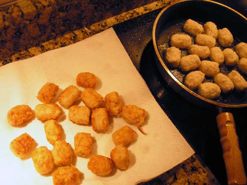
I made some tater tots, completely from scratch which, I realize, isn't saying much, but it's more effort than I usually put out. I was proud of how they looked, and I got a thumbs-up from the hubby. But I don't know that I'll be doing it again very soon. It's just too easy to buy the little frozen guys. Here's the recipe I used anyway, if you're so inclined:


Tater Tots (from Can You Stay for Dinner—her post is funnier, by the way)

serves five, as a side dish

3 medium potatoes, finely grated and dried well
¼ C all-purpose flour
1 t salt, plus more for serving
½ t black pepper (I didn't use any pepper in mine)
¼ C Canola oil

Mix the potatoes with the flour, salt and pepper. Form into 1" logs.

Heat oil in a large pot until it is so hot that dripping a drop of water on the surface immediately sizzles and spatters. Add tots and fry until all sides are golden brown.

Serve hot with extra salt.

Thursday, March 01, 2012

Sketchbook Project 2012—Wrinkly dog in color #sketchbookproject

Here you go. The wrinkly dog in color.

The further I get in the sketchbook, the heavier I seem to be applying the spray fixative. I started out worried about when I was working on the back of a page, how the page on the other side would rub and transfer to the page opposite it. So I've been laying on the fixative. Unfortunately, that seems to be messing with the transparency of the paper, so on this page you can see the Frankenstein showing through from the page before.

Not only that, I'm noticing that any green I use bleeds through the paper as yellow on the other side when I spray it.

I don't think there's much I can do about all that, so I'm moving on with the rest.

Damn the torpedoes.

Monday, February 27, 2012

My illustrations are heading to Italy! #BolognaBookFair

At the end of January I submitted a page of my illustrations for possible inclusion in the SCBWI portfolio at the Bologna Book Fair, and this would be the page I submitted.

The portfolio selection team notified me that my page was chosen to be included (yay!). Not only will it be in a physical portfolio at the book fair, but it will also be included on their site. Once my image becomes available (along with the rest of the portfolio), they will send me a link to it which I'll post here.

Here was how they described what they're doing:

"A portfolio of SCBWI illustrator members work will be on display at the SCBWI Showcase during the 2012 Bologna Book Fair and available for browsing by publishers, agents and other attendees from across the world. In addition, a digital version of the portfolio will be posted on this webpage with thumbnails of artwork and contact information as we did for our 2010 Illustrators' Gallery."
The fair will run March 19-22 this year.

Thursday, February 23, 2012

Sketchbook Project 2012—Wrinkly dog sketch #sketchbookproject

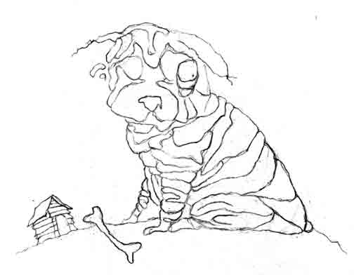
Here's another sketch from my Sketchbook Project project. It's a sketch of a really wrinkly dog with lots and lots of folds, but absolutely no stitches. That I know of.

Monday, February 20, 2012

The argument against working on spec (or, Why it feels like my idea was stolen) #nospec

Way back on April 6, 2007, I received an email from a publisher that I won't mention the name of here. I thought I finally got a bite after all those postcards I had been sending out. Here was what she wrote:
"Thank you for your interest in working with [us].

We have several projects that we feel match your talent and are interested in knowing if you are still available to illustrate picture books.

[Our] process is simply (sic). We ask that you create a rough cover and one inside spread from the text we provide. From your work we will select an illustrator based on who we feel has the best conveyance of text through art and understanding of appeal in the children's genre."
I ran the proposal past some of my colleagues in the Pittsburgh Society of Illustrators, and I got advice that went both ways. I reasoned that even if I didn't get picked I could still finish the image and use it for my own self-promotion (yet another postcard).

So I did. Here's the sketch I did for the cover.

This was the exact file I sent in (on April 18), with my name and copyright really noticeable right there at the top.

And this was how the image looked after I finished it. To be fair, I didn't actually email the publisher the final image, so the argument could be made that they never saw it.

The editor/publisher replied that if I didn't hear from her by that Friday, then she would get back to me when she got back from the Bologna Book Fair. When I hadn't heard anything by May 11, I sent an email to find out what was going on, and she said she was "still digging out from business travels, but promise to get back to you."

O.K. I guess I needed a little patience.

On September 17 I sent another email asking for the status of my submission, and that's when I found out they weren't interested in my idea.

This evening I was doing some updating of my mailing list, and I was checking out that publisher's site to see if I should keep sending to them (no, I hadn't removed them from my list yet) when I found this.

Yes, stylistically my image and the one here are very different. But nowhere in the manuscript was there any mention of the boy casting the shadow of a monster in his bedroom. Is that so obvious of an idea that somebody else actually thought of it after I did? And if this illustrator and I both sent in the same idea, wouldn't you as an editor/publisher want to go in a direction that wasn't so obvious?

As an aside, when I first found out that they didn't want me to illustrate the book, I kept watching for the book on their site to see what they had picked instead. In the beginning, there was another image on the cover that I can't seem to find on the Internet. It was a computer-generated image of a purple monster standing at the foot of a bed. The monster was in the middle of the frame, looking directly at the viewer as if the viewer was in the bed. The image above isn't the original image I saw online.

I know the illustration on the final book cover isn't taken verbatim from my idea (especially having seen what other companies have tried to get away with in swiping artwork for their designs), but knowing that the editor saw my rough and seeing the similarities in the final cover image, my post Bedtime Monster anti-spec policy has been firmly cemented.

Just say no.

P.S. I've now removed them from my mailing list.

Thursday, February 16, 2012

The @arthouse Coop have (has?) digitized my #sketchbookproject

Part of the payback for creating a sketchbook for the Art House Coop (The Brooklyn Art Library) is that they scan every page of your sketchbook and upload them for the whole world to see. They've finished scanning all of my pages, and here's the link to the digitized version:

http://www.arthousecoop.com/library/6123

If you're unfamiliar with the Sketchbook Project, here's a post that attempts to explain what it's all about:

http://nora-thompson.blogspot.com/2011/12/sketchbook-project-2012.html

And here's a ready-made search of all my posts of sketches and finished pages for the project:

http://nora-thompson.blogspot.com/search/label/sketchbook%20project

This was the Sketchbook Project 2012 version. They've just finished signing up participants for the first round of the Sketchbook Project Limited Edition, and I went and signed up for that one, too. I'll be posting about the Limited Edition project on The Rots' blog, so I'll be posting the progress on that sketchbook over there.

Monday, February 13, 2012

Sketchbook Project 2012—Frankenstein in color #sketchbookproject

Here's the finished Frankenstein page of my Sketchbook Project. This is the center spread, so what you're seeing down the middle is the tied-off end of the string from where I bound the book.

Another green Frank.
The only reason I can think of that my Frankensteins are green is because Herman had a bit of a greenish tint to him when The Munsters were in color. I used to be a big Munsters fan when I was little.

Thursday, February 09, 2012

Sketchbook Project 2012—Frankenstein sketch #sketchbookproject

Here's the next page in my Sketchbook Project for the Art House Co-op and the Brooklyn Art Library. This illustration marks the center spread which means he's also standing on the halfway-through-the-sketchbook page.

If you missed what this little project is all about, here's the post that explains all the details.

Monday, February 06, 2012

Sketchbook Project 2012—Baseball in color #sketchbookproject

And here's that little baseball player dude in color (for the Sketchbook Project 2012 sketchbook). He's wearing red and white, of course, because those were my high school's colors.

Thursday, February 02, 2012

Sketchbook Project 2012—Baseball sketch #sketchbookproject

Here's my next sketch in my Sketchbook Project sketchbook. He's a baseball player (duh). I wasn't sure at first if I should put a name on his back or not. I've sort of decided he plays for a high school team, so I'm going to leave the name off.

Monday, January 30, 2012

I can't scream this loud enough: "I'M PROUD OF JACK GANTOS!!!"

O.K. Well. There you go.

A little background, shall we?

I was working afternoon shift in Greensburg, Pennsylvania (noon-8 pm) quite a number of years ago, when I ran across some announcement somewhere that a kid's writer would be giving a free talk at our local college where I happened to be enrolled as a student. He was there to talk to the Masters in Writing Popular Fiction students, but the talk was free and open to the public.

I left work early that evening. Shh. Please don't tell.

The writer was someone I had never heard of (yet), but he came with some accolades, including a Newbery Honor for a book titled Joey Pigza Loses Control. At the time I wasn't a big reader of kid's books, and I was clueless as to who this guy was, let's just be honest.

The writer, of course, was Jack Gantos, and he turned out to be an absolutely amazing story teller. He wore a mic on his shirt throughout our little talk, displayed his writing (and, apparently, doodling) journals on a large screen behind the stage he was romping over and didn't stand still for one tiny minute. Turns out, he was a local boy. Born in Mount Pleasant, PA (me, too), grew up in Norvelt (until he was seven) and his mother still lived in Greensburg and just happened to be sitting right next to me.

***As an aside, I visit my dad every other Sunday, and Mount Pleasant and Norvelt are two small towns that happen to be part of the drive between my house and his.***

Let's just say Jack Gantos left an impression on me that evening that I'll probably never forget.

Fast forward to last Monday.

Every year the American Library Association awards some very prestigious honors for kid's books, with the two highest prizes being The John Newbery Medal and the Randolph Caldecott Medal. The Newbery goes to a writer and the Caldecott goes to an illustrator, and both are considered the highest awards that can be won by a writer or illustrator in the United States. Runners-up get Newbery or Caldecott Honors.

Last Monday the ALA announced the Newbery winners, and this time, Jack Gantos went home with the top prize for a book he wrote titled, Dead End in Norvelt. It's historical fiction about our very own little town of Norvelt. It's terribly fun to read by someone who recognizes the places and history that he mentions in the book: Frick Hospital (where I was born and where the one and only wall mural I've ever painted is located—please don't tell anyone, it's a really embarrassing piece of work), Mount Pleasant, Kecksburg (and the "UFO" landing there), Hecla (which is so small, it's hard to find a link to the right one), and the list goes on.

I got all teary-eyed when I'd heard that he had won, but adding to that that the book he won for was about my little corner of Southwestern Pennsylvania just made my day. And my month. I'm feeling a little pride for one of our own making it—and where he came from—big.

If you ever have the chance to see Jack Gantos speak publicly, don't hesitate for one second. You have to go. Trust me.

Saturday, January 21, 2012

Sketchbook Project 2012—Elephant sketch #sketchbookproject

The next page in my Sketchbook Project sketchbook is a little tubby elephant. O.K. Maybe he's a big tubby elephant, but in the sketchbook he's actually quite small as elephants go. He has folds, of course, because "Stitches and Folds" is my theme.

Wednesday, January 18, 2012

Sketchbook Project 2012—Butler in color #sketchbookproject

Here's the second page (not including the title page) of my Sketchbook Project 2012. He's a butler. With a towel. Click the image to see it biggie-sized.

Monday, January 09, 2012

Sketchbook Project 2012—Harley in color #sketchbookproject

O.K. Admittedly I'm running a bit on the late side with this one. I signed up for the Sketchbook Project 2012 months (and months) ago but, unlike the usual get-it-finished-way-before-it's-due me, I'm getting the color done on these pages way too last minute for my blood pressure (it's due Jan. 31). I would include the link for the project, but right now they're signing people up for the Sketchbook Project Limited Edition, and I can't find a link anymore for the regular Sketchbook Project 2012.

So here you go. The first color page (after the cover and title page, of course) finished and stamped with "done". I posted the sketch for this little guy last August. Apparently, at the time I named him Harley so I guess we'll have to go with that.

Say "hello" to Harley.

Thursday, December 22, 2011

Sketchbook Project 2012—Title Page #sketchbookproject

The next page in my Sketchbook Project sketchbook is inside the front cover and the title page (you didn't think I wouldn't have a title page, did you?). And here's the post with the cover image (and an explanation about the Sketchbook Project, if you don't already know what it's about).

Monday, December 19, 2011

Sketchbook Project 2012 #sketchbookproject

Next year (next month!) I'll be participating in the wildly successful Sketchbook Project, put together by the Art House Co-op and the Brooklyn Art Library. I know, I know, I sure waited a long time to jump on the wagon, but at least I'm not falling off of it. I posted my first sketch in an earlier post.

The Sketchbook Project works like this:
  1. I order a sketchbook from the Art House Co-op
  2. They send a sketchbook specifically for me, with a bar code on the back identifying me and my sketchbook
  3. I draw in said sketchbook (this seems to be the part that's taking the longest)
  4. I send the sketchbook back to the Art House Co-op
  5. They scan all the pages of my sketchbook and include them in their digital library and post them on their site
  6. They gather up all the sketchbooks from this collection (this collection being 2012) and take them on tour around the country starting in April
  7. After the tour, the sketchbooks are cataloged as a permanent fixture of the Brooklyn Art Library, available for patrons around the world to enjoy (hopefully)
  8. Every time someone "checks out" my sketchbook it will be logged through the bar code on the back, and I can check my stats in real time online or through text messages
  9. That's it
We had to pick "themes" for the sketchbooks, and the one I picked was Stitches and Folds. I thought I could do something cool with that idea. My first page from the sketchbook is actually the cover, and here it is (ta-da):

Each image will include some sort of stitch or fold (in the drawing of it, not an actual stitch or fold, which I played around with and discovered didn't work so well) opposite a page with a song lyric that I think goes well with the image.

I rebound (rebinded?) my sketchbook (you're allowed as long as you follow their rules) with some toothier paper (theirs was too smooth and too white), so the stitching on the spine is mine (and part of my theme).

Due Jan. 31, 2012.

What was I thinking?

Saturday, December 03, 2011

A Little Like Shaun Tan

A few weeks ago I finally made my way to Gettysburg, Pennsylvania. I wasn't there to visit the place, although we have plans of returning next year for actual Gettysburg reasons. So much history. I feel so attracted to something there.

But this post isn't supposed to be about Gettysburg.

I hauled my butt across half the state for an SCBWI conference, and yeah, I came home with lots of thoughts to think loudly about. But I'll attempt to narrow those thoughts down to just one: Jordan Brown.

I had a manuscript critique with Jordan, a Senior Editor at Walden Pond Press and Balzer + Bray, imprints of HarperCollins Children's Books. The story I had written was a short story I had finished for a fiction writing class I took about eight years ago (has it been that long?). My professor at the time loved it, and in his comments at the end wrote, "Get it published."

And yet.

The story wasn't long enough. I knew it wouldn't make a complete book. But, being an illustrator—and pictures are easier for me than words—I had the brilliant idea (I thought, at the time) to pad the short story with pictures to make it long enough. Maybe even convert it into a graphic novel (Mr. Punch-style). Yeah. A graphic novel. Then the words would be at a minimum, and I could tell a lot of the story just using images.

Yeah. Images.

But Jordan didn't really agree.

He was thinking more along the lines of, say, a novel.

"You mean those things with all the words?"

"Those things with all the words."

But there was something in the story he had latched onto. Something he didn't want me to lose as I was writing more. Something he likened to...

Shaun Tan.

Shaun Tan? Really? How could he know?

What he liked about what I had written was all the stuff I hadn't written. How you didn't know when or where the story was taking place. Was it in the past? Or the future? Or was it even on this planet?

He totally got it.

He said it seemed like I was working in the sort of space that Shaun Tan occupies (not bad company to be in), but a very difficult one to break into (not what I wanted to hear).

It wasn't until I read this article in the Guardian today (and written by Neil Gaiman, no less) that I realized how right Jordan was. The paring things down. The fictional landscape. The far future, the distant past.

I had decided before I left the conference to take Jordan's advice and write the whole thing as a novel. He even suggested I take a look at A Monster Calls by Patrick Ness, not just for the loss of the protagonist's mother, but also (as I figured out when I got the book) for the illustrations. They're beautiful. I thought, yeah, writing all those words is going to take a while, but I can supplement all those words with some really cool pictures.

Pictures. My comfort food.

But as soon as I finished the book that little doubt devil started spewing into my brain again, and I started growing doubt shoots. Doubts about all those words. A Monster Calls was good. It was really, really good. And heavy (in a deep sense, not in a weight one). Can I really write something as relevant as that? Why am I doubting my writing? Why am I dragging my feet with this story?

What am I afraid of?

I won't be able to start writing for a few days anyway, so in the small spurts of time I have until then, I've decided to absorb a little Shaun Tan. The Rabbits. Tales from Outer Suburbia. The Lost Thing. I'm hoping in the time we spend together Shaun will help me find the confidence I'm thinking must be lurking around here somewhere.

And then after that, if I've been good, I can get back to the pictures.

Thursday, November 17, 2011

Surviving a weekend

So I managed to survive the SCBWI conference in Gettysburg over the weekend. Gettysburg is such a fantastic place. I'd never been there, and can't wait to go back. The history is heart-wrenching. I went on a ghost tour. I bought a bullet. I found a picture book in the same shop as the bullet only to see that it had been illustrated by someone I've admired for years. And then I met that very illustrator at the conference (more on him in another post). I cried during E.B. Lewis' keynote speech. An agent saw my portfolio and asked to meet me. What a whirlwind. So many new people, so many new friends, so much to think about.

And so much more to do.

As you can probably tell, I survived my manuscript critique with Jordan Brown (see my misgivings here in an earlier post). He was, despite my fears, terribly helpful and encouraging. I only wish I could have had a recording of everything he said because, of course, I didn't take notes. He was excited and hopeful about my book idea, which made me excited and hopeful about my book idea.

Now the uphill climb begins.

Turns out I tend to make friends easier with editors at these conferences than I do art directors and agents. Not sure why that is. The problem with that is that editors want me to write stuff (ugh!). Pictures aren't good enough; they aren't happy until they've pushed me over that ugly, word-laden hill.

So I guess I'm heading toward the next step in my children's book career. Thanks to Jordan Brown, my next move will be at my computer keyboard writing a novel.

Yes, a novel.

Apparently short stories don't have enough words. Now I have even more of those steep, torturous word-hills to climb.

Did I mention "ugh!"?

I can do this. Nobody's ever croaked from writing a novel, have they?

Someone please tell me I can do this.

Monday, October 24, 2011

More Vlad Hot Cocoa

In May I finished an illustration for a drink mix directory that was published by the Pittsburgh Society of Illustrators in August. I called it Dancing in the Moonlight, and I had that old King Harvest song in my head the entire time.

(As an aside, just try and listen to that song and then get it out of your head. Not gonna happen. I had to download it.)

The illustration was part of the exhibit that PSI put together at Gallerie Chiz in Shadyside, and it will be in another exhibit starting in November at the Art Institute of Pittsburgh.

But I had an idea.

Next month I'm attending the Tri-Regional SCBWI conference in Gettysburg. They're going to do something called "First Looks" where illustrators send in three related images to possibly be included as part of a panel discussion. The images will be projected for everyone at the conference to see (no pressure there), and the panel (editors, agents and an art director) will offer their first responses to the images.

I really didn't have anything finished that I thought would be good enough, so I decided to create two new images to go with Dancing in the Moonlight. The images I've posted here are the sketches for those two images.

Due Nov. 1.

And now if you'll excuse me, I have some painting to do.

Saturday, October 15, 2011

This should make me a happy camper

I have to admit, I haven't been creating much in the world of illustration lately. I've been focused pretty intently on getting my book out (in a few weeks, my pretties), painting a few Rots (just finished Buster on Wednesday) and getting organized for the fall SCBWI conference coming up next month in Gettysburg.

Yeah. About that conference. This year I decided to jump in the ring and get the text of a graphic novel idea I wrote a while back critiqued by one of the faculty. Our regional advisor is totally pushing me toward an editor named Jordan Brown. She says he would "love" the kind of stuff I do and she thinks we would get along "fabulously".

(By the way, where do periods fall in relation to quotation marks these days? Inside or outside?)

So I'm asking to be placed with Mr. Brown, and my fingers are kind of crossed.

Kind of.

I've been following along with Gris Grimly's blogging about the new three volume book he's been working on for the past few years. He's tackling Frankenstein and, as usual, his work is phenomenal. Beautiful. Inspiring.

Makes me want to crawl in a hole somewhere and start crocheting lap robes for a living.

His latest post isn't helping.

Turns out the editor for his Frankenstein books? Yeah. Jordan Brown. I'm torn between jumping for joy and crawling under a rock to take up residence with the isopods. If Jordan Brown has somebody like Gris Grimly in his back pocket, does somebody like me really have much of a chance?

I'm finding my rock as we speak.

Ouchy.

Thursday, September 15, 2011

I finally saw North by Northwest

So I finally had a chance to see the Hitchcock classic North by Northwest a couple of nights ago, and I noticed some things. Not necessarily things that had anything to do with the plot or the directing or the acting.

Things I noticed:
  • People were skinnier in 1959. Or, Hitchcock only hired actors who were. I'm thinking a little of both.
  • Movies were longer in 1959. Over two hours for this one.
  • Martin Landau was very handsome when he was a young man. Martin Landau was once a young man. Martin Landau was skinny when he was a young man.
  • James Mason was young once but, apparently, he's always been classy. And skinny.
  • Now that we don't do it anymore, smoking in public looks really, really stupid.
  • Eva Marie Saint was young once, but at 35 could never pass for 26. Sorry.
  • They had bus stops in the middle of nowhere in 1959. How, exactly, was a rider expected to get to and from?
  • Cary Grant's character's initials are R.O.T., which I find amusing.
  • People were able to fall in love instantly in 1959, in spite of knowing nothing about each other. Or, people watching movies in 1959 were more ready to embrace the concept.
  • The kissing scene between Cary Grant and Eva Marie Saint would pass for a G rating today, but it still made my dad uncomfortable having to watch it in a room with me.
I have to admit, I wanted to see the movie mostly for the house at the end that looked an awful lot like Frank Lloyd Wright's Fallingwater (where I work), but is not, in fact, Fallingwater (see the article by Sandy McClendon on jetsetmodern.com). We've had rumors going around at work that Hitchcock wanted to use Fallingwater, but wasn't permitted to do so. I haven't found anything on the Internet to confirm or deny those rumors, but I have found where he wasn't allowed to film at the United Nations building so he used hidden cameras and filmed anyway.

Also, Fallingwater doesn't need steel beams to hold up its cantilevers. We use post-tensioning instead.

Sunday, September 11, 2011

September 11 has nothing to do with September 11

Ten years ago on September 11, 2001, my step daughter turned 21 years old. She was young. She was 21. She had planned on spending her birthday drinking with friends. But that evening the bars were closed, for reasons beyond any 21-year-old's control.

And suddenly it's ten years later. So much has happened.

And so much has changed.

This morning my husband and I will be heading to the cemetery. New York and D.C. and Shanksville will be crowded with people looking for...something. A little bit of comforting, maybe.

We'll be heading toward a small lake near a gazebo in Delmont, to a single plot of earth, far away from the crowds. And we'll have each other.

Happy birthday, Lauren.